For sites that have been built Responsive, this plugin will enable you to adjust your content too.
On mobile devices like smart phones people are less likely to read very long pages of content and with Responsive Content plugin you can adjust the text showing on these different devices..
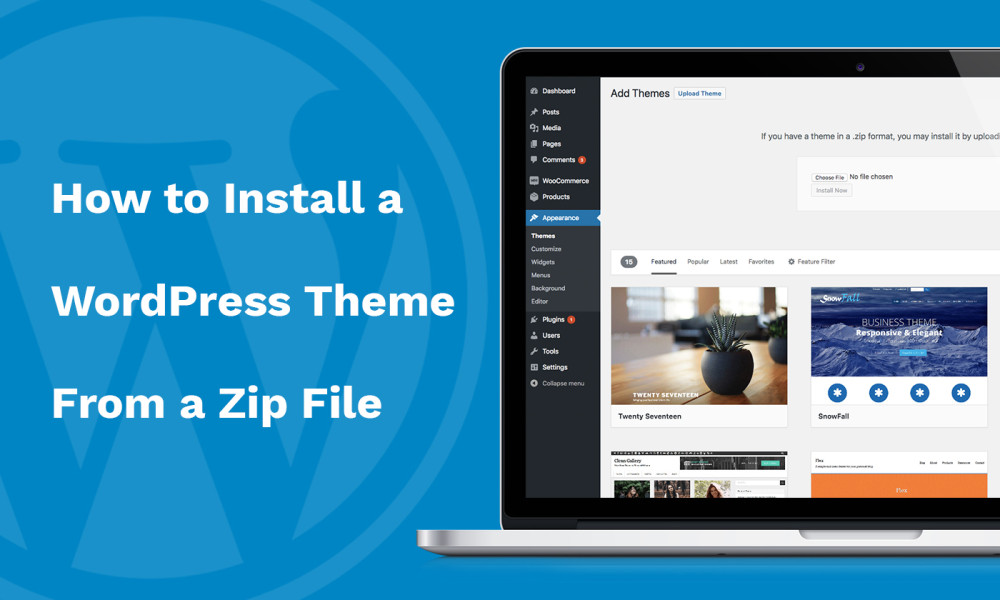
The SO Responsive Content plugin adds Formats drop down menu ( pre WP 3.9 the menu is called.
Styles ) to the first line of TinyMCE Editor.
Once you have selected visibility class, the plugin shows that in 3 locations as selected in the drop down menu with a button in front of the selector in the path..
There are visibility classes in the Styles on Visual Editor 6 for paragraphs 3 for links 6 for spans ..
The plugin already comes with all the styles necessary to show the elements on or hide them from the front end, so all you need to do is save your Post, Page or other Post Type and visit your site from few different devices to see your content change depending on the width of the browser..
The reason is that the SO Responsive Content plugin uses media queries with display block, display inline-block and display none.
If you were to add image to show on large screens, image to show on tablets and image to show on smart phones, then the person visiting your site using phone has to download all 3 images.
To show images it's much, much better to implement MobileDetect script on your site..
Read more
Related items:

